Kitchens By Design
Toggle Navigation
Toggle Navigation
Toggle Navigation
KBD Launches New Website

KBD is excited to announce the launch of our new website mykbdhome.com!!!
image

We are truly excited to present this website as a representation of the KBD brands, bringing every facet of our products and services to clients.

For the past 16 years Kitchens by Design has taken a holistic approach to design, coordinating a cohesive space plan and design with fixtures like cabinetry and countertops.  As our team has grown, bringing individual ideas, strengths, insights, and talents, our process has become more collaborative, allowing clients the benefit of many ideas and years of experience. Our clients needs have also expanded and as such our vision at Kitchens by Design has evolved.

image

These changes lead to growth in the products and services we offer and culminated in the launch of KBD Home in 2013.  While Kitchens by Design continues to serve clients with cabinetry design expertise, KBD Home is a design and retail boutique of home furnishings, hand-crafted bedding and pillows, and home accessories.

The opening of KBD Home prompted the addition of Custom Drapery Service to the KBD team.  For over sixty years CDS has been creating one of a kind window treatments in the Indianapolis area.  We are excited to have veteran seamstresses fabricating hand-made draperies, pillows, and custom bedding all in our on-site workroom.
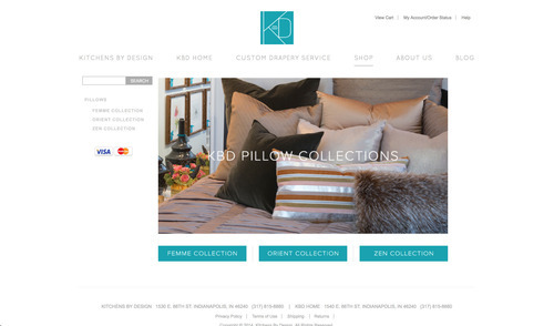
imageKBD is excited to showcase our cutting edge ideas and design abilities in all areas of the home on our new website.  Please take the time to browse our online gallery of projects, learn more about KBD and our team, and visit our online store featuring our latest pillow collections!

If you see something you like please give one of our designers a call or stop by to visit our showrooms and see everything we have in store to make your home a KBD HOME.

Always, KBD [the Visual Storyteller]


[Style Your Home] HIPSTER

HIPSTER – A PERSON WHO FOLLOWS THE LATEST TRENDS AND FASHIONS  Key word – latest.  Hipster decor as you know, is nothing new.  However, it is so cool and funky that we don’t see this fashion fading anytime soon.  As designers we like to keep things fresh, following trends while at the same time creating new ones.  Anyone can throw a goodwill collection together and call it hipster but if you really want your hipster to stand out, we suggest you follow these tips to keep your hipster up to date!

First off, a few hipster DONT’S…

The “KEEP CALM AND CARRY ON” print has got to go.  It is extremely over-done.  Keep calm and carry that print on out to the trash.  Please.

MASON JARS, MUSTACHES & RETRO EYEWEAR…oh my.  Need I say more?  Over-played.

TACKY CHRISTMAS STRING LIGHTS.  We love mood lighting but taking the lights off your Christmas tree and pinning them to your wall in a scalloped pattern looks juvenile and messy.

BADLY HUNG TAPESTRY/TOO MANY TAPESTRIES.  Tapestries can look pretty cool if placed in the right space.  However try not to cover your walls with hundreds.  This can look cluttered, block natural light and potentially make your space look smaller.

BOB MARLEY POSTERS.  Over-done.  We get it.  He was cool. He was a rebel, he smoked pot.  But unless you truly madly deeply love him, refrain from plastering his face all over your walls.

GOOD DESIGN IS A LOT LIKE CLEAR THINKING MADE VISUAL – Edward Tufte  When designing any space, it is important to take your time.  Think about the look you are trying to achieve, the palette you want to use and the vibe you want your space to exude.  Creating a hipster decor takes time; it is almost like a collection process.  When we think of quality hipster design we imagine eclectic style with a minimalistic approach.  That being said, keep in mind these hipster DO’S when creating your perfect space!

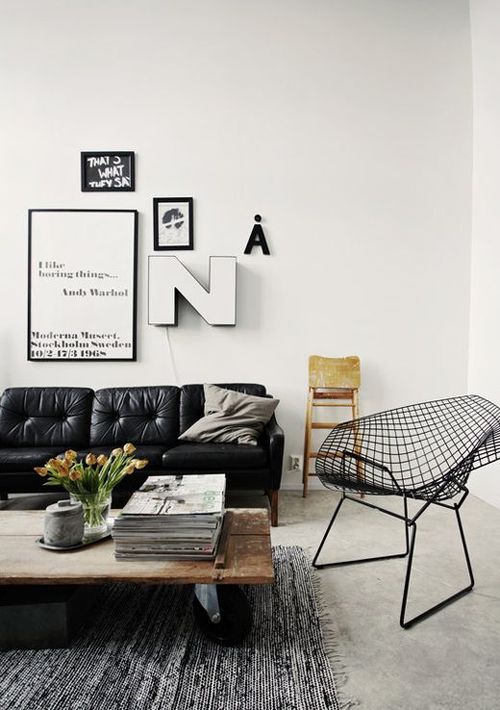
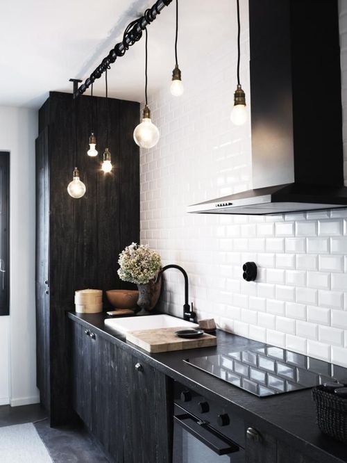
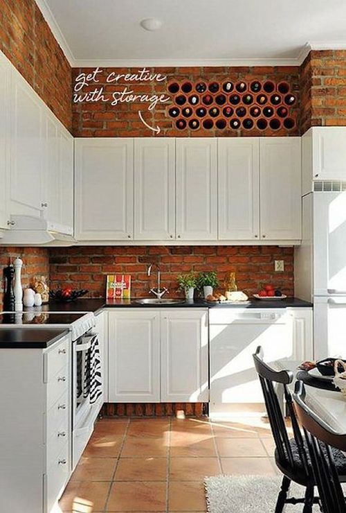
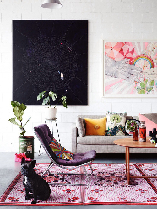
GET INDUSTRIAL.  Every hipster space needs a little masculinity.  Some ways to achieve this can be adding a brick accent wall (no, don’t make one – brick wallpaper works wonders if you don’t have an existing brick wall).  Having brick warms up your space and gives it an urban loft feel while keeping your trendy hipster style.  Another must is the use of metal and/or wire, distressed wood and our most favorite, exposed Edison light bulbs!

image

photo via myparadissi.com

image

photo via remodelista.com

image

photo via Coco+Kelley

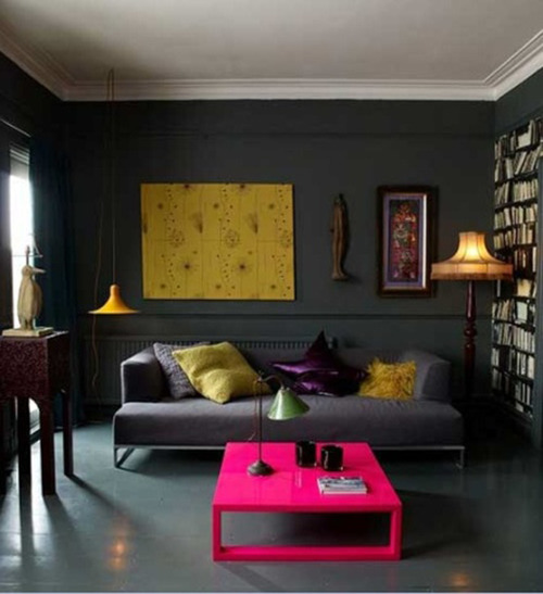
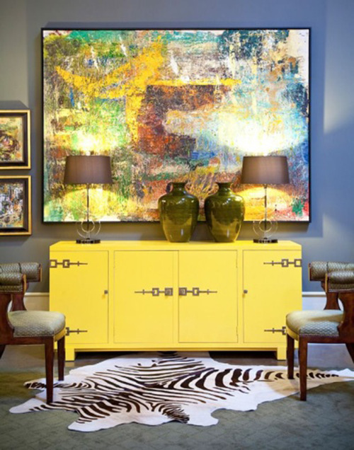
GET MOODY.  Think outside the box with your color palette.  For walls, fabrics and furniture use rich, bold colors.  Consider painting one wall a dark, moody color.  This creates a focal point of interest and is the perfect palette for lighter objects to really pop!  However, keep in mind less is more – balance out your bold colors with stark whites or creams.  And the simple key element, mismatch and layer.

image

image

photo via Gray Livin’

image

photo via garyriggshome.com

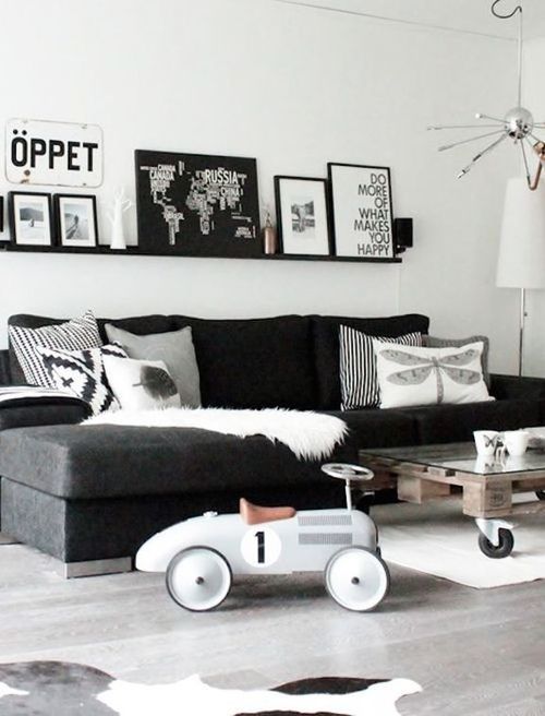
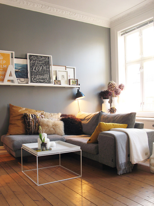
GET IT TOGETHER.  We can all agree frame walls are a must.  Hanging up anything and everything without any rhyme or reason however is not a must.  When creating your frame wall, stick to one or two colors for your frames. This creates a more cohesive look even though what’s inside the frames will vary.  Adding a letter, number or sentimental object(s) into the mix is also a nice touch.  This gives the wall dimension and keeps it from looking too match-matchy.

image

photo via lowehome

image

photo via Home Sweet Home

image

photo via K+BB Collective

GET THRIFTY.  A big characteristic of the hipster style is vintage furniture and accessories.  Less is DEFINITELY more when it comes to vintage furniture.  You don’t want your space looking like a Goodwill catalog (if they had one).  But a few pieces of cool, worn and old furniture are totally okay.  For new furniture, again use bold colors with vintage bodies, fabrics, etc.  Using more furniture that is new with a vintage style will keep your space looking clean and fresh – too many pieces of vintage start to look like grandma’s living room.

image

photo via Jessica Tocko

image

photo via dailycrush.net

GET A CAT.  Cats are cool and they look super hipster walking around your hipster space.  Moral of the story:  Show what you love.  Let your room showcase your hobbies, taste in music and personal style.  These are guidelines to help you not rules.  So be creative, have fun and feel free to share with us your beautiful spaces!

Always, KBD [the Creative Accomplice]


[TREND] All Marble Everything

Back in 2008, it seemed like Raf Simons cracked a case for a rock we all know and love. Applying its naturally intriguing qualities to clothing seemed like a novel concept. And people caught onto the stunning stone’s use in non-traditional applications. The trend has stuck around and we believe it’s one to watch.

image

Raf Simons for Jil Sander Fall 2008 Menswear via style.com

Another favorite designer, Jeffrey Campbell, applied this paleo-pattern to his leather Roswell boot for a mix of hard and soft. The versatility of marble’s natural coloring can pack a punch or turn a sole into a stately sculpture.

image

Jeffrey Campbell’s Roswell Boot via nastygal.com

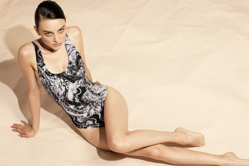
Seventh Wonderland’s Huile Marble one-piece swimsuit makes for a statuesque surf.

image

via Seventh Wonderland

Australian interior designer, Paul Hecker, infused a timeless modernism into the Toorak residence where he used the perfect amounts of marble to make to seem as if he took a chisel and mallet to carve out this home that has a chilly stoicism and a warm friendliness, simultaneously.

image


image

image

photos via thedesignfiles.com

Simply breathtaking.

These marble plates make eating as much of an adventure as visiting a museum, standing awestruck as a witness to the skill and patience it takes to give this cold stone a pleasant warmth.

image


Independent artists from Society 6 have caught onto the beautiful simplicity of marble used in home decor. This Italian Marble Rug by Cafelab is a wonderful accent to any entryway.

image

via society6.com

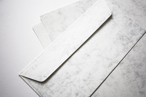
Rather than sending a boring plain white envelope, this Marmor stationery by Europapier offers a sophisticated solution to escaping the norm while remaining timeless.

image

photo via europapier.com

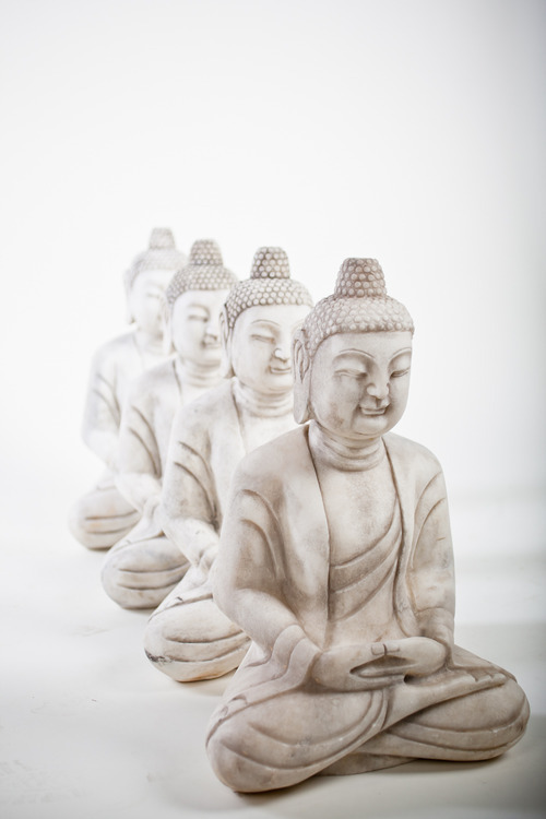
The elegance of marble is apparent wherever it’s used. And we love these marble Buddha sculptures available here, at KBD Home.

image

We have a feeling marble isn’t going anywhere soon.

Where do you think we’ll see it next?

Always,

KBD


Spring Shopping Spree

Sunday afternoon was anything but lazy as our spring spree commenced. Hosted by David and Mary Salon, the event turned the normal breezy day into an immersion experience of sipping, styling and, obviously, shopping.

image

Guests welcomed by a champagne bar, were attended to by some of the city’s most experienced stylists. Advice for every facet of life was given free of charge. Fitness tips, makeup consultation and home accessory solutions were a few of the valuable tidbits offered.

image

We provided the accessories, giving the salon a fresh, new aesthetic.

image

DJ Gabby Love spun a killer set that made us forget we had to work the next day. 

The ladies from 14 Districts helped guests curate a unique day style that was comfortable and chic.

image

Our own Kristin Okeley created a beautiful and impressively extensive spread of food that kept guests coming back for more. Everything on the table was truly delicious and emphasized the value of impeccable presentation.

image


image


image


image

We can’t thank David and Mary, 14 Districts and Fitness by Design enough for being the best at what they do and stellar collaborators.

Can’t wait to do it again.

Always,

KBD


Friday in Fashion: Summer Leather

Leather has always been somewhat of a sultry fabric. But it’s never been a very breathable one.  Here’s to continuing to smolder this summer without suffocating.

Photographer Candice Lake caught fashion editor, Taylor Tomasi Hill, looking effortless and sexy in Paris. Donning this leather dress with a cinched waist, Hill looks put together and still breezy. The absent sleeves and the skirt length and shape, leave breathing room to pull off this look in the summer sun.

image

Photo via Candice Lake

Leather shorts make looking put together so simple. A plain, loose white tee makes for a chic day look. The juxtaposition of soft fabrics and harder leather creates interest. Choose a breathable cut for an airy sophistication.  

image

Photo via The Fashion Latte

Even in the summer heat, a change of hue can make a difference. If the sun is beating down and you still want your outfit to look bohemian chic, try a camel colored leather. You’ll attract less rays and more notice. This jacket is sexy-cool and has some extra fringe benefits.

image

Photo via Fashion Tag

If you’re absolutely overcome with warmth, ditch the sleeves and opt for a enticing vest. There’s no easier way to look like you just care enough.

image

Photo via Trop Rouge 

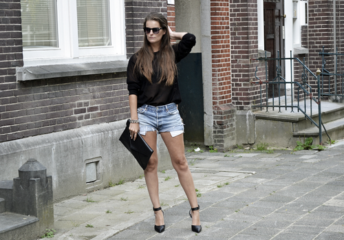
If there is one thing Mirte V. knows, it’s how to simmer in leather heels. These pointed, strappy beauties turn this super relaxed outfit into a fashion focused ensemble.

image

Photo via Mirte V. at lookbook.nu

Leather used in the home can be as versatile, seasonally. Use leather as much for its physical nature as you do for its aesthetic appearance.

Keep leather in the shadows as much as possible so it provides a cool place to rest indoors, even if this means rearranging your room. Keeping it out of the direct sun will also keep it from fading and cracking. 

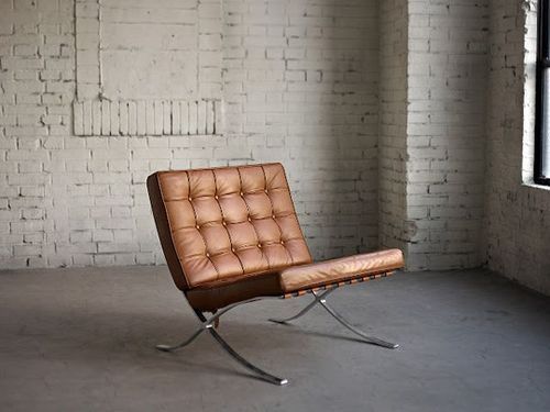
This camel Barcelona Chair by Iconic Interiors is sexy, sophisticated and a color that works well with the changing seasons.

image

Whichever way you style it, this product of mother nature (as all of her creations) will remain a classic.

Always,

Erin for KBD


Hello world!

Welcome to WordPress. This is your first post. Edit or delete it, then start blogging!


We have more to say.

Follow us on Twitter @mykbdhome.


6 Design Myths Debunked

People get into ruts with design. No need to repeat these design myths any longer.

Myth #1: Everything has to match.

How do you expect to have an elegant place to eat if everything doesn’t match? Easily. These distressed vintage chairs evoke the same feelings but they certainly aren’t the same color or style.

image

Photo via KT Merry 

Myth # 2: Variety only exists in color and pattern.

Any monochromatic space offers a new and exciting challenge of creating contrast with texture, shape and size. Engage all the senses to create a design experience that envelopes you rather than screams at you. This all-white room from Vogue Living is a perfect example of contrast and interest.

image

Photo via Vogue Living 

Myth #3: That has to go against the wall.

Designer, Chris Nguyen, curated his personal studio space where very little actually is sitting flush against a wall. It keeps the space breezy and open. His artwork is suspended between two windows, his couch compartmentalizes his spaces and his room divider replaces a bulky awkward TV by doubling as a projection screen.


image

 Photo via Analog Dialog

Myth #4: Being trendy is foolproof.

Your personal style may go through phases, but at the core you are less volatile than most magazines suggest you should be. Accessorizing may be where you rotate your newest favorite color or pattern but don’t make the mistake of choosing expensive pieces that you’ll be over tomorrow. You’re not changing that much and your space should reflect that timelessness.


Myth #5: The ceiling needs to be white.

Why? It won’t necessarily open up your space and make it look larger. The eye will often ignore a white ceiling, keeping the eye from moving upward. Painting a ceiling two shades lighter than the walls adds interest and draws the eye upwards, mimicking higher ceilings.


This metallic ceiling in this David Kleinberg design certainly draws the eye upward and performs a key function to making a room look and feel larger; it reflects the natural light.

image

Photo via David Kleinberg 

Myth #6: You have to stick to one style.

Why give a room a diagnosis? You’re limiting its potential. These two spaces from Nuevo Estilo prove that backing a space into a style corner is a mistake. Without the juxtaposition of Victorian and rustic, I could assert that this space would be much less interesting and most likely, less livable.

image

imagePhoto via Lusia Olaz

What other myths have you heard?

Always,

Erin for KBD


Undisclosed Design: America’s Speakeasies

Everyone needs their secrets. And no secret is more fun than a rad space only you are privy to (well, at least you feel that way).

These elusive and exclusive speakeasies nod at the prohibition era of the past and the seeming prohibition of privacy in our present day.

Here’s our list of the most intriguing—least secretive to most.

6. Please Don’t Tell, New York

imageimage

Well, too late, someone told.

Inside an East Village hot dog shop (behind the phone booth, of course), the illuminated bar top of Please Don’t Tell acts as a beacon, leading customers to a rich, personal drinking experience. With unique drink specialities like the bacon-infused Benton’s Old Fashioned, we hear the bartenders are as talented as they are easy to entreat.


5. The Violet Hour, Chicago

imageimageimage

Camouflaged from the Wicker Park foot traffic by an ever-changing exhibition of graffiti, The Violet Hour reveals a modern take on the old-fashioned speakeasy. After opening the door and pushing past the giant velvet curtains, customers are welcomed into a beautiful secret. Everything from the interior decoration to the drink recipes is fresh and progressive. The Juliet & Romeo (a mix of Beefeater, mint, cucumber, rose water) is among their famed cocktails.


4. Room 13, Chicago

image

image

Apparently you’ve lucked out if you get into Room 13 and you aren’t a guest of or a paying member of the Old Chicago Inn (or a guest of either). If you happen to get your hands on the daily password, you’ll be granted entrance to the red-lit room filled with period decor and classic 20s cocktails.  


3. Wilson & Wilson Private Detective Agency, San Francisco

image

What’s more exciting than a speakeasy within a speakeasy? Very little we imagine. It’s like another magic closest inside Narnia. This time, you’re required to have both a password to the Agency and the Bourbon & Branch in which it rests—cool.


2. The Franklin Mortgage and Investment Co., Philly

imageimage

While its entry isn’t any more exclusive than a popular restaurant, the Franklin has a history rich with bootleggin’ and money launderin’. Max “Boo Boo” Hoff, originator of the operation, was said to be at the front of the liquor ring, greasing police and the like, all while fronting as an investment firm in the late 1920’s.

It’s said the drinks are killer. And with an entire section of the drink menu entitled “I Asked Her For Water, She Brought Me Gasoline,” we’re intrigued.


1. Night Heron Speakeasy, New York

image
image

They expected this illegal activity to last six weeks. And while it did, it was purely awesome.

N.D. Austin of Wanderlust Projects, a transgressive placemaking collective, proves that rules are suggestions and old can become new again.

More importantly, Wanderlust understands that any space can be transformed into something wondrous—even an abandoned water tower.

The second coolest part of this ticking-time-bomb venture were the invites. Pocket watches secretly passed person to person served as a token of direction and entry into this intimate watering hole.

In its short life, it was able to give only 700 people the experience of a lifetime. Relive what they saw, below.


The Night Heron: NYC Water Tower Speakeasy from Brooklyn Laboratories on Vimeo.

Fingers crossed that we are able, one day, to be the first to write about a secret even fewer know…or create our own.

Always,

Erin for KBD


Recipe for A Sophisticated Easter Brunch

Cornstarch-stuffed creations and obnoxiously bright decorations may make for a kid-friendly holiday, but if there are no young ones running around this Sunday, you may opt for an adult afternoon complete with pretty cocktails and muted palettes.

We’ve collected some ideas that inspire us to create a simple, yet sophisticated Easter brunch.

Everything lifestyle blogger, Julie Blanner does, looks effortless. Her easter table from last year (and this year, too!) is no exception.


image

Photo via Coordinately Yours

Julie’s muted color palette keeps the celebration mature, but comfortable. The freshness of her design certainly lifts the spirit and channels the feelings of rebirth and resurrection of our hearts, mind and Mother Nature.


image

Photos via Coordinately Yours

Here are a few of our favorite details from her tablescape. The centerpiece is especially lovely, relaxed but purposeful.

Laura Zindel’s china dinnerware sets are always stunning. For this celebration, her Woodland collection would be especially timely and would sit beautifully atop the table Julie has curated.


image

Photos via Laura Zindel Design


Keeping it fresh and interesting is always easier with a beautiful fruit cocktail to start the day off. We were especially intrigued by Martha Stewart’s Little Rose Spring Cocktail. This milky, rosy mixture of Sauvignon Blanc, Muscatel and grapefruit juice is pleasing to both the eye and the taste buds. image

Photo via Martha Stewart


Brunch food is simply the best.

And when it comes to clean eating, Katie Ferrell of the Dashing Dish knows her stuff. These brunch recipes will make you feel good and remain guilt free.


image

Carrot Cake Protein Pancakes by Dashing Dish


image

Crustless Asparagus Quiche by Dashing Dish

And of course, no Easter celebration is complete without…


image

Skinny Deviled Egg by the Dashing Dish

 While being around friends and family is the most important part of every holiday, it certainly doesn’t hurt to enjoy one another in a beautiful space. 

Happy Easter All,

KBD